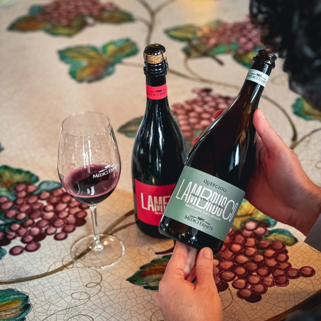
When we decided to renew the Quercioli line, we were mostly driven by a need: to have a more effective label.
The previous one was thin, placed at the bottom of the bottle (inevitably, given the format) and composed of thick paper with various finishes.
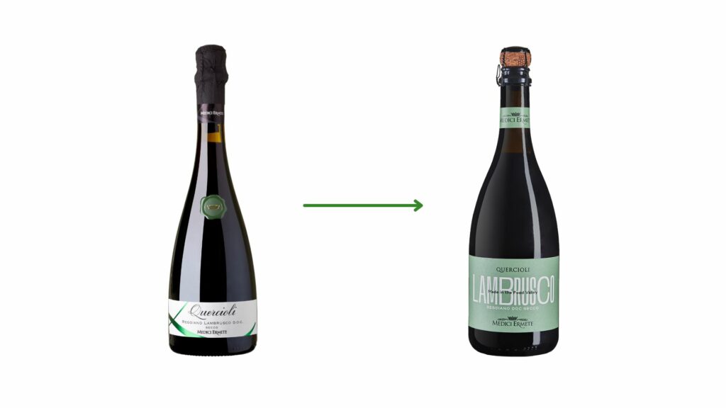
The new version is larger thanks to a larger label space on the new bottle and is made of simpler paper and finish.
What are the needs that led to the change?
- We felt the need to have our brand name and our wine more visible and recognizable.
- The information to be communicated on the back label has increased significantly in recent years, not having suitable space made them chaotic and difficult to manage.
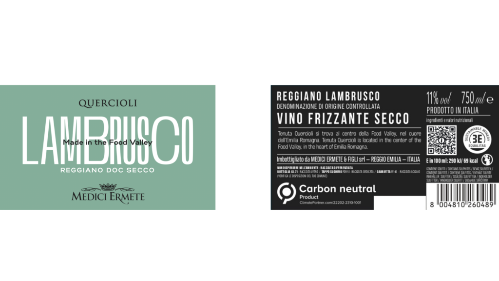
In particular, we have included:
- The nutritional and environmental label, in the form of a QR code (mandatory in EU)
- The Carbon Neutral logo, as we have worked hard to make the entire line carbon-neutral.
How do the new certifications impact the production of the Quercioli Line?
Follow us in the next posts to find out